When most founders launch a company, they view their logo as a simple checkbox. They hire a cheap freelancer, pick a color they personally like, slap it in the top-left corner of their website, and move on to writing code.
This is a massive financial mistake. If you want to know how to design a startup logo that converts, you must stop treating your logo as an art project and start treating it as your primary trust signal.
In the highly saturated 2026 digital economy, consumers make subconscious judgments about your company’s legitimacy within 50 milliseconds of the page loading. If your logo looks generic, unbalanced, or pixelated, the user’s brain immediately associates your product with risk, spam, and poor quality. They bounce, and your Customer Acquisition Cost (CAC) skyrockets.
In this masterclass, we are going to bridge the gap between graphic design and conversion rate optimization (CRO). We will explore the psychology of shape, the exact startup logo design guidelines 2026 demands, and how to engineer a visual identity that turns skeptical visitors into paying users.
Table of Contents
The Psychology of Conversion: Why Design Dictates ROI
A logo converts by doing one specific thing: eliminating friction through trust.
If you are a FinTech startup asking users to connect their bank accounts, or an e-commerce brand asking for a credit card, trust is your only currency. Your logo is the visual shorthand for that trust.
The Cognitive Fluency Rule
Cognitive fluency is the psychological metric of how easy it is for the human brain to process information.
- High Fluency: Simple, recognizable shapes and legible fonts. The brain processes it instantly, releasing dopamine and creating a feeling of safety.
- Low Fluency: Complex, chaotic, multi-colored designs with illegible cursive fonts. The brain struggles to decode it, releasing cortisol and triggering suspicion.
To boost conversions, your logo must be highly fluent. Complexity is the enemy of conversion.
Learn more: How to Build a Startup Brand Identity
Startup Logo Design Guidelines 2026: The New Rules
The era of “Blanding”, where every B2B SaaS startup used the exact same minimalist, lowercase, sans-serif font (think early Airbnb or Uber), is officially dead. Consumers in 2026 suffer from brand fatigue; they crave distinct personality.
However, standing out doesn’t mean breaking the rules of user experience (UX). Follow these strict guidelines:
1. The Death of the “Literal” Logo
Amateur designers design literally. If you sell shoes, they draw a shoe. If you sell cloud software, they draw a cloud.
Literal logos do not convert because they look like cheap clipart. They limit your startup’s ability to pivot later.
The Fix: Use abstraction. The Nike logo isn’t a shoe; it’s a swoosh representing motion. The previous Twitter logo wasn’t a megaphone; it was a bird representing short, fast communication. Design for the feeling of your product, not the literal function.
2. Responsive Logo Design Best Practices
Your logo will not just live on a desktop website header. It will be squished into a 16×16 pixel browser favicon, a social media profile circle, and a mobile app icon.
You must design a responsive logo system:
- The Master Logo: The full icon and wordmark (text) used for wide desktop headers and investor pitch decks.
- The Stacked Logo: A vertical arrangement used for narrow mobile screens and t-shirts.
- The Mark (Icon Only): The standalone symbol used for app icons and social media avatars.
If your master logo has tiny, intricate lines, they will completely disappear when scaled down to a mobile app icon, ruining your brand recall.
3. The “Dark Mode” Imperative
Over 65% of global users browse their devices in Dark Mode. If you design a beautiful dark-navy logo on a white artboard, it will completely vanish when a user switches their phone to Dark Mode.
You must design your logo in High-Contrast SVG formats, ensuring you have a dedicated “Reverse/White” version that pops instantly on black UI backgrounds.

Color Psychology: Best Logo Colors for Conversion Rates
Color is not a stylistic choice; it is a psychological trigger. Different colors release different chemicals in the brain. Choosing the best logo colors for conversion rates depends entirely on the emotion you need the user to feel right before they click “Buy.”
- Blue (Trust & Security): Used by Stripe, PayPal, and Chase. Blue lowers the heart rate. If your startup handles sensitive data, money, or enterprise B2B contracts, blue minimizes perceived risk, increasing sign-up conversions.
- Red (Urgency & Passion): Used by Netflix, YouTube, and Target. Red increases the heart rate and creates a sense of immediate urgency. It is phenomenal for fast-food apps, entertainment startups, and impulse-buy e-commerce.
- Green (Growth & Wealth): Used by Shopify, Robinhood, and Whole Foods. Green signals the “Go” action, financial prosperity, and organic purity. Perfect for eco-tech, investment apps, and health brands.
- Black/White (Luxury & Exclusivity): Used by Apple, Uber, and high-end fashion. Minimalism creates a premium void. If you are selling high-ticket software ($5,000/month subscriptions), a stark black-and-white logo justifies the premium price tag.
The Golden Conversion Rule: Whatever color you choose for your logo, that color should never be used for your primary “Add to Cart” or “Sign Up” buttons. You must use a contrasting complementary color for your CTA buttons so they stand out against your brand theme.
Typography: The Silent Salesman
If your logo includes a wordmark (your startup’s name), the typography does 80% of the heavy lifting. The wrong font will destroy your credibility.
- Serif Fonts (The Traditionalists): Fonts with little “feet” on the edges (like Times New Roman or Georgia). These communicate heritage, academia, and journalistic truth. Excellent for legal-tech, high-end journalism, or boutique luxury startups.

- Sans-Serif Fonts (The Modernists): Fonts with clean, straight edges (like Inter, Helvetica, or Proxima Nova). These communicate efficiency, speed, and modern technology. Mandatory for B2B SaaS, FinTech, and consumer apps.
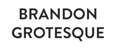
- The Legibility Test: If a 50-year-old investor with bad eyesight cannot read your logo from five feet away, it fails. Never use overly aggressive cursive or highly distressed “grunge” fonts if you want high conversion rates.
The 2026 Reality: AI Logo Generator vs Professional Designer
To save runway, many founders are searching for the ultimate AI logo generator vs professional designer comparison. Tools like Midjourney, DALL-E 3, and automated logo makers are incredibly powerful in 2026. But should you use them for your final brand?
The Verdict: Use AI for Ideation, Humans for Execution.
- The Problem with AI Logos: AI generators output raster images (pixels). They do not output clean, mathematically perfect Vector graphics (SVGs) organized in distinct, editable layers. Furthermore, AI cannot trademark a design; you cannot legally protect an AI-generated image under current US Copyright Office guidelines.
- The Conversion Impact: If you upload a pixelated, non-scalable AI logo to your website, it will look blurry on Apple Retina displays. Blurry logos destroy trust.
The Winning Workflow: Use AI prompts to generate 50 unique conceptual ideas in 10 minutes. Take the best concept, hand it to a professional UI/Brand Designer on Upwork or in-house, and pay them to recreate it as a mathematically perfect, legally trademarkable vector graphic.
Local SEO and Geo-Targeted Startup Logos
If your startup serves a specific, hyper-local market (e.g., a real estate prop-tech app exclusively for Miami, or a logistics startup in Nairobi), incorporating subtle local geography into your logo can boost conversion rates dramatically.
- The Hometown Advantage: Consumers inherently trust local businesses more than faceless multinational corporations.
- The Execution: Do not be cliché. (If you are in New York, do not make your logo the Statue of Liberty). Instead, use subtle nods. Use the exact hex code of your local sports team as your accent color, or use a geometric abstraction of your city’s skyline in your “Mark.”
- The Conversion Lift: When a local user sees your geo-optimized logo on their Google Business Profile or Facebook Ad, they instantly recognize the cultural “inside joke,” creating an immediate bond and drastically lowering your Cost Per Click (CPC).
Expert Insights: What You Are Missing
If you want to design a logo that truly converts, you must look past the canvas. Here are two expert-level tests that 90% of startups fail:
1. The Silhouette Test
Remove all the color from your logo and turn it completely black. Is it still instantly recognizable?
The Apple logo, the Twitter Bird, and the Nike Swoosh pass this test flawlessly. If your logo relies entirely on three different gradients to make sense, it is too complex. It will fail to convert when printed in black-and-white on a physical invoice or a low-resolution screen.
2. The App Icon “Thumb” Test
Your logo’s “Mark” must fit perfectly inside the standardized rounded square of an iOS/Android app icon. Print your logo out at exactly 1-centimeter by 1-centimeter. Place your thumb next to it. If the lines blur together and it looks like a smudge, you need to increase the thickness of your strokes (lines) and simplify the geometry.
FAQ: Startup Logo Design
Q: Should I put .com or .ai inside my actual logo design?
A: No. In the early 2000s, this was common, but today it looks dated and amateurish. Your logo is your brand identity, not your URL. Keep the legal/web suffixes out of the design.
Q: How much should a startup logo cost in 2026?
A: A cheap Fiverr logo costs $10 but offers zero strategic value. A professional freelance brand designer will charge between $500 and $5,000 for a comprehensive visual identity system (Logo, typography, color guidelines). Top-tier agencies charge $20,000+. Invest what you can, but remember: cheap design yields cheap conversions.
Q: Should my logo be horizontal or vertical?
A: Horizontal. The vast majority of website headers (nav-bars) are short and wide. A horizontal logo allows your brand name to be legible without pushing your website’s main navigation menu down the screen.
Q: Can I change my logo later if my startup pivots?
A: Yes. Massive rebrands (like Uber or Slack) happen often. However, rebranding is expensive and causes a temporary dip in brand recall. It is vastly superior to invest in an “abstract” logo on Day 1 that can scale with any product pivot.
Conclusion: Stop Decorating, Start Converting
Learning how to design a startup logo that converts requires you to strip away your personal artistic ego and focus entirely on the psychology of your end-user.
Your logo is the front door to your business. If the door is cracked, dirty, or confusing to open, nobody is going to walk inside to see your incredible software or products.
By utilizing responsive vector designs, optimizing for Dark Mode, choosing colors based on neuro-marketing, and abandoning literal clipart, you transform your logo from a simple decoration into a high-performance conversion engine.
Stop settling for “good enough.” Audit your startup’s visual identity today, apply the Silhouette Test, and build a brand that commands immediate, unwavering trust.
We Want to Hear From You
Has your startup recently rebranded? Did you see an actual change in your website’s bounce rate or sign-up conversions after updating your logo? Drop your before-and-after experiences in the comments below! If you are stuck deciding between two different logo concepts, share them with our community, we’d love to vote on the winner!