
It is the most common and frustrating scenario in technical SEO. You finish optimizing your homepage, run a test, and celebrate a 99/100 desktop score. But when you toggle over to the mobile tab, your score plummets to a 45/100. You are left staring at the screen asking: “Why is my LCP slow on mobile but fast on desktop?”
You are not alone. In 2026, the divide between desktop and mobile performance is wider than ever.
As developers and SEOs, we typically build and test websites on $3,000 laptops connected to ultra-fast fiber-optic Wi-Fi networks. But Google’s algorithm does not care about your MacBook Pro. Mobile-first indexing means your search rankings are dictated by how your site performs on mid-tier smartphones connected to congested cellular networks.
In this deep-dive guide, we are going to tear down the illusion of desktop testing. We will explore the exact hardware and network bottlenecks that destroy mobile Largest Contentful Paint (LCP) scores, and provide you with the expert-level techniques required to achieve a green score across all devices.
Table of Contents
The Illusion of Desktop Performance
To understand the problem, you first have to understand the hardware. When looking at Google PageSpeed Insights mobile vs desktop, the tool is essentially running two completely different simulations.
- Desktop Simulation: Simulates a fast broadband connection and a powerful desktop CPU.
- Mobile Simulation: Simulates a mid-tier mobile device (historically a Moto G Power) on a throttled 4G cellular network.
Because desktop processors possess immense single-thread performance capabilities, they can brute-force their way through unoptimized code. A desktop can download a massive 3MB image, parse thousands of lines of JavaScript, and render the LCP element in the blink of an eye.
A mobile phone simply cannot do this. Let’s break down the three fundamental reasons your mobile LCP is failing.
Why is My LCP Slow on Mobile but Fast on Desktop?
Wondering why is my LCP slow on mobile but fast on desktop? Discover how CPU throttling, network latency, and image scaling destroy your mobile rankings.
Reason 1: The Mobile CPU Throttling Trap
The most overlooked aspect of mobile LCP is render time. LCP is not just about how fast an image downloads; it is about how fast the device can draw that image onto the screen.
Mobile processors (CPUs) are exponentially weaker than desktop CPUs to preserve battery life. Furthermore, browsers run on a “main thread”, a single lane of traffic that handles HTML parsing, JavaScript execution, and image rendering.
If your website loads heavy third-party JavaScript (like ad networks, tracking pixels, or chat widgets), a desktop CPU processes it in 50 milliseconds and moves right on to painting your LCP image.
However, a mobile CPU might choke on that exact same JavaScript, taking 800 milliseconds to process it. During those 800 milliseconds, the main thread is locked. Even if your hero image has already downloaded, the mobile browser cannot draw it on the screen until the JavaScript finishes.
The Verdict: Your mobile LCP isn’t slow because the image is too big; it is slow because your JavaScript is hogging the mobile CPU, forcing the LCP image to wait in line.
Reason 2: The Physics of Mobile Network Latency
The second major difference is the network itself. A desktop computer on Wi-Fi or Ethernet benefits from incredibly low latency.
Mobile phones rely on cellular networks (4G/5G). Cellular data transmission requires your phone’s radio to wake up, negotiate a connection with a physical cell tower, route the request through the carrier’s network infrastructure, and then out to the wider internet.
This creates immense mobile network latency LCP delays, primarily affecting your Time to First Byte (TTFB) and Resource Load Delay.
- Desktop Latency: ~10ms to 20ms to establish a connection.
- Mobile 4G Latency: ~100ms to 300ms just to establish the connection before a single byte of data is even downloaded.
If your web server requires multiple round trips to negotiate SSL handshakes, DNS lookups, and redirects, a mobile user loses a full second of time before the LCP image even begins to download.
Reason 3: The Responsive Image Disaster (CSS Resizing)
Here is where most web developers unknowingly sabotage their mobile LCP.
It is 2026. You have a beautiful 2400-pixel wide hero image for your desktop layout. To make the site “mobile responsive,” you apply CSS:
max-width: 100%; height: auto;
On a desktop, this looks great. On a mobile phone, the screen is only 400 pixels wide. The CSS visually shrinks the image to fit the mobile screen perfectly.
The fatal flaw: The mobile browser still had to download the massive, 2400-pixel wide, 2-megabyte file just to shrink it down to 400 pixels using CSS. You are forcing a weak mobile phone over a slow 3G/4G network to download an image that is 600% larger than what the screen can actually display.
Desktop internet speeds can mask this inefficiency; mobile networks immediately expose it.
Smart Image Resizer
A powerful yet simple tool that lets you
resize images without distortion, blur, or pixelation.
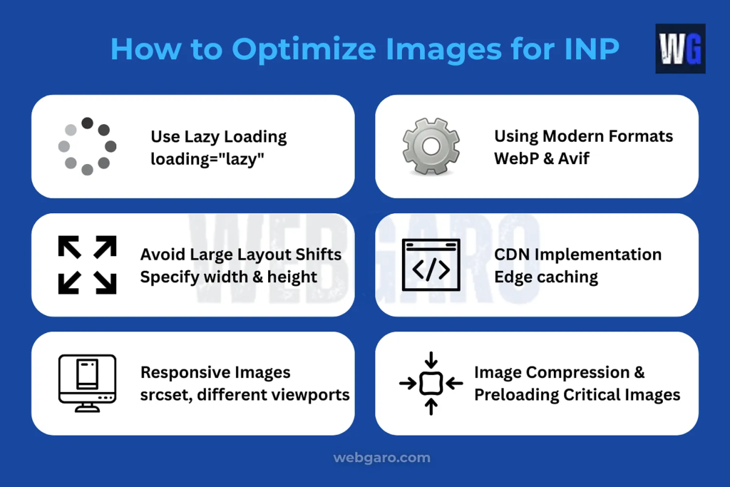
The Expert Fix: How to Optimize LCP for Mobile Devices
Now that we have diagnosed the hardware, network, and asset differences, it is time to apply the fixes. If you want to optimize LCP for mobile devices, you must treat mobile rendering as a completely separate engineering task from desktop rendering.
Step 1: Implement Strict Art Direction with <picture>
Stop relying on CSS to resize your LCP images. You need to implement a true responsive image LCP fix using HTML art direction.
The <picture> element allows you to provide the browser with multiple image files. The browser evaluates the user’s device width and only downloads the specific file meant for that screen size.
The 2026 Code Standard:
<picture>
  <!-- If the screen is mobile (max 767px), ONLY download this tiny 50KB image →
  <source media="(max-width: 767px)" srcset="hero-mobile-400w.avif" type="image/avif">
  <!-- If the screen is desktop, download the large 300KB image →
  <source media="(min-width: 768px)" srcset="hero-desktop-2400w.avif" type="image/avif">
  <!-- The fallback tag (Always use fetchpriority on the LCP) →
  <img src="hero-desktop-2400w.jpg" alt="Product Demo" fetchpriority="high" loading="eager">
</picture>
By feeding the mobile browser a properly cropped, 50KB AVIF file, you bypass the network latency bottleneck entirely.
Step 2: Ruthlessly Delay Non-Critical Mobile Scripts
Because mobile CPUs are so easily overwhelmed, you must fiercely protect the main thread during the initial page load.
- Defer Everything: Ensure all <script> tags in your document <head> use the defer or async attributes.
- Use Partytown for Trackers: If you are running Google Tag Manager, Facebook Pixel, and Hotjar, use a Web Worker library like Builder.io’s Partytown. This moves third-party JavaScript off the main thread, freeing up the mobile CPU to render your LCP image immediately.
- Conditionally Load JS: Does your desktop site have a complex mega-menu that requires a heavy JavaScript library? If that menu isn’t used on the mobile layout, do not load that JavaScript file on mobile devices!
Step 3: Utilize Edge Computing (The Global Latency Fix)
Expert Local SEO Insight: Let’s look at a real-world geographic scenario. Suppose you operate a server hosted in Nairobi, Kenya, but you are trying to capture the USA market for an e-commerce brand.
A desktop user in New York on fiber internet might still load your site relatively fast due to sheer bandwidth. But a mobile user in New York on a 4G connection requesting data all the way from an origin server in Kenya will suffer catastrophic LCP delays due to transatlantic packet routing and cellular latency combined.
The Solution: You cannot outrun the speed of light. To fix mobile latency, you must implement an Edge CDN (Content Delivery Network) like Cloudflare or Fastly.
An Edge CDN caches your entire HTML document and your LCP images on servers located inside the United States (e.g., a data center physically in New York). When that mobile user requests your site, the data only travels a few miles, not across an ocean. This slashes your TTFB and instantly rescues your mobile LCP score.
The Ultimate Diagnostic: Field Data vs. Lab Data
As you implement these fixes, remember the golden rule of Core Web Vitals: Always look at the CrUX Field Data, not just the Lighthouse Lab Data.
In PageSpeed Insights, the Lab Data (the score out of 100 at the bottom) is a simulated mobile test. But your Field Data (the real-world user data at the top) reflects the actual phones your customers are using.
If your Field Data LCP is failing, but your Lab Data LCP is passing, it means your actual audience has weaker phones or worse cellular coverage than Google’s simulated Moto G device. This is a massive red flag that your page is too reliant on heavy JavaScript or massive CSS files that real-world mobile CPUs cannot handle.
FAQ: Mobile vs Desktop LCP Discrepancies
Lighthouse mobile tests throttle the CPU and network to simulate real-world conditions. Because this is a simulation running on Google’s testing servers, minor fluctuations in server load can cause your score to bounce 5 to 10 points. Rely on the 28-day Field Data average for the true metric.
No. While replacing a hero image with a solid CSS background color will technically yield a lightning-fast LCP, it often ruins the user experience and bounce rate. A properly sized, AVIF-formatted <picture> element loaded with fetchpriority=”high” will easily pass the 2.5-second threshold without sacrificing design.
Yes, indirectly. A slow Time to First Byte (TTFB) from cheap hosting is exacerbated by mobile network latency. A 500ms server delay on desktop might just result in a 0.5s penalty. On mobile, due to connection negotiations, that same server delay can snowball into a 1.5s penalty.
Mobile viewports are narrow and tall. Often, your hero image is pushed down, and your H1 headline text becomes the largest visible element. To fix a text-based LCP, ensure your web fonts are preloaded and use font-display: swap in your CSS to prevent a Flash of Invisible Text (FOIT).
Conclusion
Answering the question, “why is my LCP slow on mobile but fast on desktop” requires a fundamental shift in how we view web development.
Desktop environments are forgiving. Mobile environments are ruthless. By understanding the severe limitations of mobile CPU processing power and the inherent latency of cellular networks, you can stop relying on CSS hacks to resize massive desktop assets.
Audit your site today. Implement strict <picture> tags for art direction, strip away render-blocking mobile JavaScript, and utilize Edge caching to bring your data closer to the user. When you optimize for the weakest device on the slowest network, you build an impenetrable, lightning-fast foundation that Google’s mobile-first algorithm will reward.
Join the Discussion
Have you checked your mobile vs. desktop scores today? What is the gap between the two? Drop your Desktop Score and your Mobile Score in the comments below! If you have a specific mobile LCP bottleneck you can’t seem to clear, let us know and our technical team might jump in with a fix!